


The Challenge: App Overload
Most fintech companies build apps. However, the Indian market is saturated; users are reluctant to download "yet another app" for occasional tasks.
-
The Problem:
The Indian investor is overwhelmed. Between broker apps, AMC platforms, bank portals, and broken journeys on aggregators like MFCentral/MYCams, users are suffering from Investment Fatigue. -
The Goal:
Users don't want a new destination; they want their money to work for them where they already live. The goal was to build a "set-and-forget" experience that mirrors the passive nature of Zerodha Fund House products. -
Target:
Focus on execution and tracking rather than broad discovery.
The Experiment:
Testing the Waters
We didn't start with a high-fidelity prototype. We started with a live experiment on the official Zerodha WhatsApp number to validate two things:
-
Capability:
Can a chat interface handle sophisticated financial flows? -
Trust:
Will users trust a "green bubble" with their life savings?
Version 1: The "Bare-Bone" Alpha (yes we started as a chat bot)
The initial flow was a bare bone, and only catered to user who already had folios with Zerodha fund house.
-
The Flow:
A simple message-and-link system. Message the amount → Select the fund → Pay via link → Receive digital acknowledgment. -
The Result:
We didn't just get clicks; we got data. * We tracked average SIP amounts, return-to-track frequency, and service queries (withdrawals/statements).
The Breakthrough
A Diwali "Gold Push" marketing campaign resulted in ₹1 million worth of SIPs in 3 days. This proved that WhatsApp users are Trigger-Based Investors, they respond to reminders, not active searching.
The Research:
We adopted the Theory of Planned Behaviour as the framework to design our study and analyse the findings.
It posits that a decision and subsequent planned behaviour are influenced by the integration of three key factors: attitude, subjective norms, and perceived behavioural control.
These elements collectively shape an individual’s intention and Inclination to engage in a particular behaviour.

Using the same framework, we tried to understand the factors that affect the Mutual fund investment behavior

We asked questions related to users demography and background to be able to understand pattern in investment originating for socio-economic factors.

We doubled down on our qualitative research and created user cohorts
Majorly the first phase of the research helped us setup the framework for identifying different cohort of users.
We identified 4 major cohort that came our after consolidating all the user interview we did. And the patterns that we could identify between each cohort.

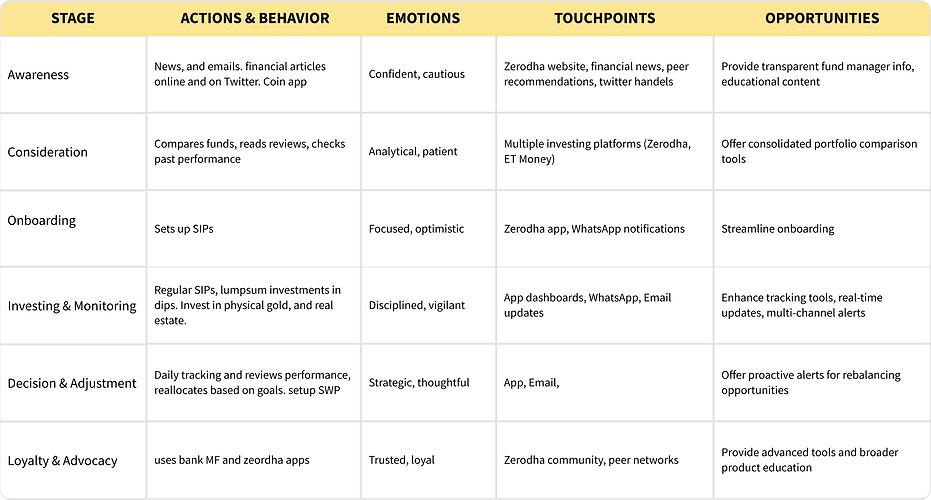
We also consolidated the research into a users' red routes, behavior patterns, and identified touch points and opportunities for each cohort

The MVP Design
In Version 2, we moved from an experiment to a product.
We debated features heavily and made the strategic decision to limit the scope to increase the speed of execution:
-
No NRI/Minor flows: Focused strictly on individual resident portfolios.
-
MF only, no ETFs: To maintain the "Passive/Simple" value proposition.
-
Execution over Discovery: We assumed the user already knew why they were there. The UI was built for the "How."
-
Live Tracking: Based on support queries, we added live-tracking numbers directly in the chat, eliminating the need for users to ever leave the thread.
We brainstormed and used lightweight visual components to represent investment growth and tracking, ensuring the data stayed dynamic without sacrificing the visual trust of a premium financial service.

The Constraint: Designing within a "Box"
Building for WhatsApp isn't like building for iOS or Android. We faced a unique technical "tug-of-war":
-
The Conflict: Standard WhatsApp UI is restrictive, but a basic HTML landing page felt untrustworthy for a financial product.
-
The Solution: We brainstormed and used lightweight visual components to represent investment growth and tracking, ensuring the data stayed dynamic without sacrificing the visual trust of a premium financial service.

The Result: Traction over Trends
By prioritizing repeat use cases (tracking) and quick execution:
-
Performance: ₹2 million worth of SIPs set up within 120 days.
-
Efficiency: Drastically lower Customer Acquisition Cost (CAC) compared to app-install campaigns.
My Key Learning: Design Thinking > Pixel Pushing
This project was a masterclass in Design Thinking over traditional UI design. My role was less about making things "pretty" and more about:
-
Radical Simplification: Spending hours deciding what to remove (features, data points, extra steps) while maintaining absolute user trust.
-
Psychological Safety: Understanding that in fintech, clarity is the highest form of beauty. If the user feels safe, they will convert.
-
Flow as a Product: Realizing that the "UI" wasn't just the screens—it was the entire timing and tone of the WhatsApp messages.